Online Presentation Guidelines
In 2022 the judging will be via a video link. You will have submitted a Registration Package that included a 5-page summary of your project. The judges will have seen this report. To prepare for your oral presentation and the questions from the judges you must do the following:
- Ensure that you have a reliable network connection using a COMPUTER – desktop or laptop are acceptable. The platform that will be used is NOT COMPATIBLE with tablets or mobile devices. Make sure that your microphone is working and the video is operational. A second video connection (to perhaps show your project) is optional.
- You should prepare a slide presentation to describe your project
- Slides must be prepared using Google Sheets or Microsoft Powerpoint
- The maximum number of slides allowed for presentation is 30
- The minimum point size for the text on the slides is 24-point. Titles should be 28-point.
- The maximum length of the presentation is 15 minutes.
- A slide with references can be in 12-point (do not expect the judges to read it)
- Know how to display your slides “full Screen”
- If you are well-organized you may be able to refer back to particular slides (or ones not in your presentation) to answer questions
- If you include figures, all axis labels and any text in the figures must be readable
Useful Hints for Slide Preparation
Do not put large blocks to text on your slides. A judge will not be able to read them and pick out the essential points.
- A sans serif font is generally more readable – calibri, ariel, comic sans
- Make use of Bullets to make important points stand out. Good and Bad examples are shown below.
- Do not try to put too much material on a slide – less is more! Clarity is the goal
Text Example
These slides use 28-point for titles, Comic Sans font. Blue is 24-point.
Even with large font size the text in paragraph format (LHS) is hard to read and identify the main points. The slide on the RHS is much clearer and a viewer can quickly scan through it. This is about the maximum amount of material you should put on a slide. Could you improve it more?
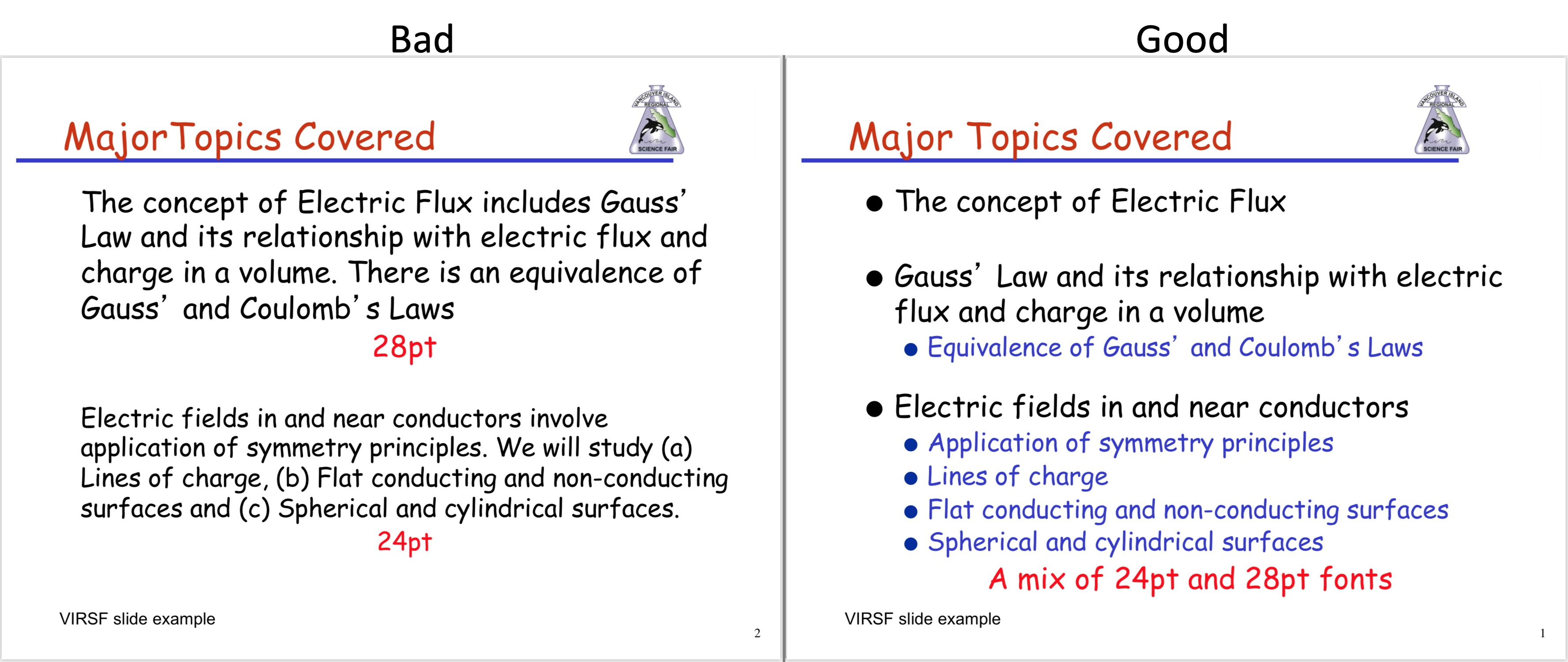
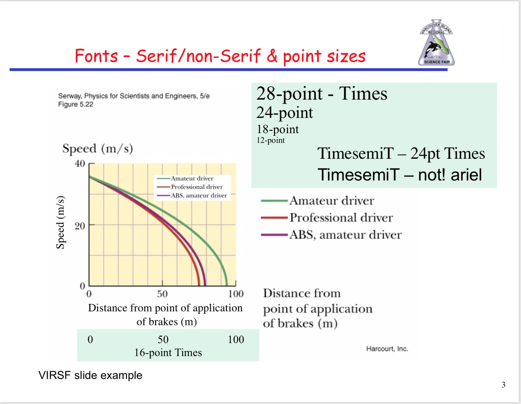
Figure Example
This slide shows some options for displaying a figure. The original from a Serway Physics text had the following:
- Only the curves inside the box
- Some colour in the box to separate it from the slide background
- Tick lines extend from each axis – this makes it easier to interpret the curves
Do not use too many ticks/labels. You do not have to label every tick - Curve descriptions are off to the right side
- Axis labels
– horizontal label to right at the level of the axis
– Vertical label above the graph to the left. - Numerical values at selected tick marks along each axis
- For the figure the font size for the labels and numbers is 16-18 point. This is acceptable for a figure displayed at this size on a slide.
If you include a Figure Caption make it in a larger font size that the axis labels. On this figure 18-20 pt would be OK.
A different option for displaying the labels/descriptions is shown. The axis information is still clear but arguably the curve labels are a bit too small.
To show how font size displays at different sizes on a slide examples from 12 pt to 28 pt are shown. Also you can see the difference between the Time font (serif) and Arial font (sans-serif) are shown. Plus there is a reminder to always check your spelling. (Serif fonts have little embellishments at the tips of the letters).